
It’s much easier for me to make major life, multi-million dollar decisions, than it is to decide on a carpet for my front porch. That’s the truth.
[Oprah Winfrey]

Midwinter-tide was all about picking the interior colors. Not an easy task, omg.
With 200 decisions to make per square foot (so they tell me), I try to spread each choice over as great a distance as possible. We’ve got one color coating the entire exterior, for example. We’re using the same color a couple shades lighter for all exterior trim.
With “keep it simple” as a guiding principle, we’d already ventured into the realm of interior hues and settled on a few things.
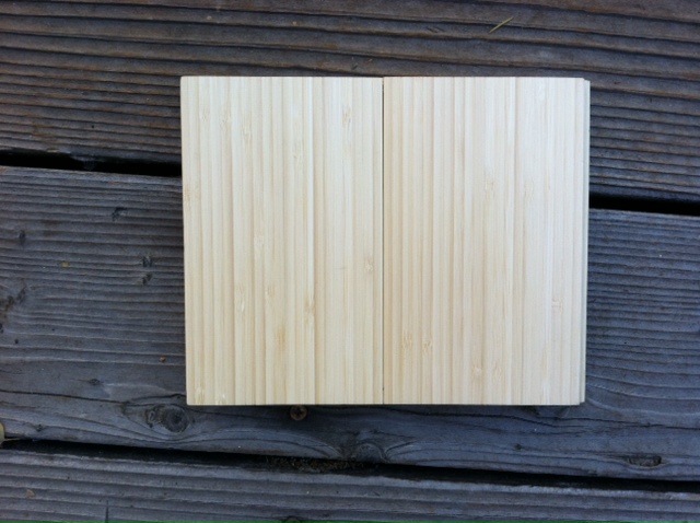
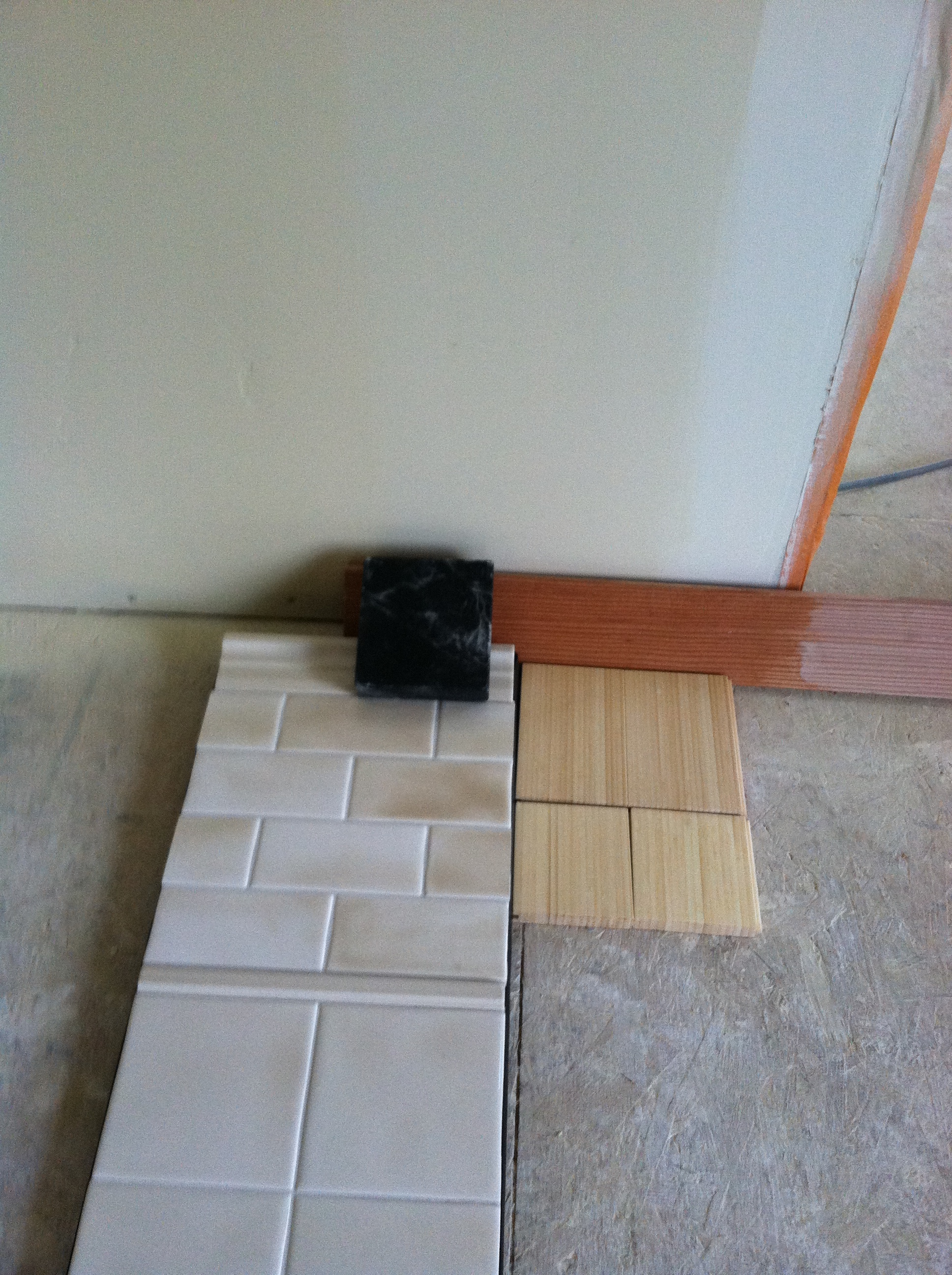
Decision #1: extra-pale yellow, edge-laminated, natural grain bamboo flooring (Smith & Fong “Plyboo”) everywhere except the bathrooms.
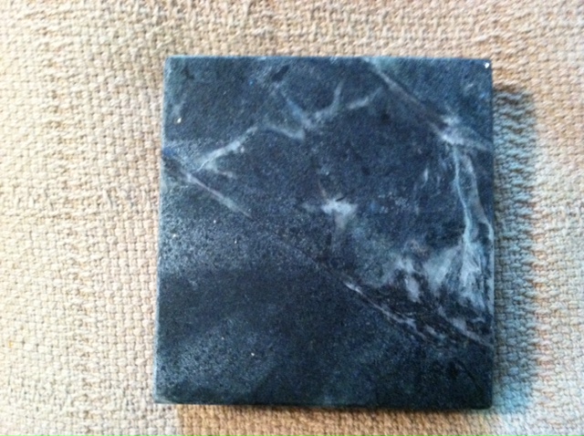
Decision #2: Venata soapstone for the kitchen counters.
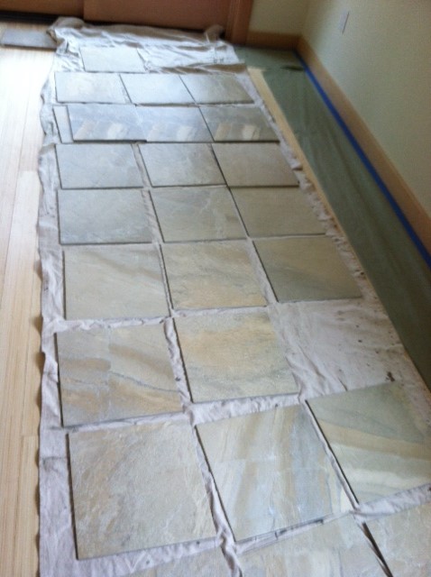
Decision #3 (this took me ages): DalTile Ayer’s Rock (gold) – on all bathroom floors, shower walls, and counters.
That left ceilings and walls (already sheet-rocked), doors, stair railings, and trim (door frames, baseboards (all vertical-grain Douglas fir)).
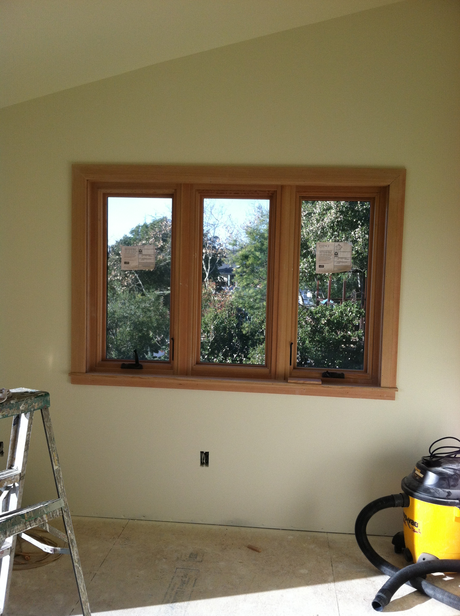
I wanted to go light with the woodwork, to connect it to the pale-yellow floor, and go classy on the walls with a neutral that would pick up and bring out the warmth of the fir and bamboo. “Old-fashioned” classy, I should say. Current trends tend toward darkish neutrals, grays and browns. With a house full of light, I was thinking a creamy, French vanilla-y, white-with-a-drop-of-gold would be the ticket – something subtle that would make my walls cozy and bright at the same time. Mary Martinez snagged me a handful of paint chips that echoed the honey-golds in the floor; I handed them over to our painter, Jim Horn, and started testing stains for the doors and trim.
And hit my first hitch. I figured I’d whitewash the orange out of the wood, clear-coat it, and ta-DA! But all my attempts to mute the natural ruddiness of the fir epically failed. Jim did his own set of whitewash tests, with similar results. He also tested several other stains, and one of them, a beautiful golden pecan, looked absolutely terrific with the bamboo floor. We ok’ed it, and he went on to mix paint.
Which led to the second hitch. Turned out, I hadn’t clearly communicated that I wanted a drop of gold in an otherwise white base. The primer went up and I freaked – it was totally yellow!
Somehow everyone (but me) thought the paint choice had been made, Jim was ready to go – and suddenly I was under major pressure to make my bloody choice already, that was the color I’d asked for, time’s a wasting, hurry up hurry up hurry up!
I pointed to a wall I thought representative (master bedroom, just inside the doorway). Jim gave it 3 broad swathes of color, which merged at their edges to create 5 choices. On a Friday afternoon in late, late December, I tested them all against my floor, tile, and trim samples. I spent the next day hitting up my family and friends for their thoughts on the matter.
Here’s the striped wall,
here it is with the foyer tile and fir trim,
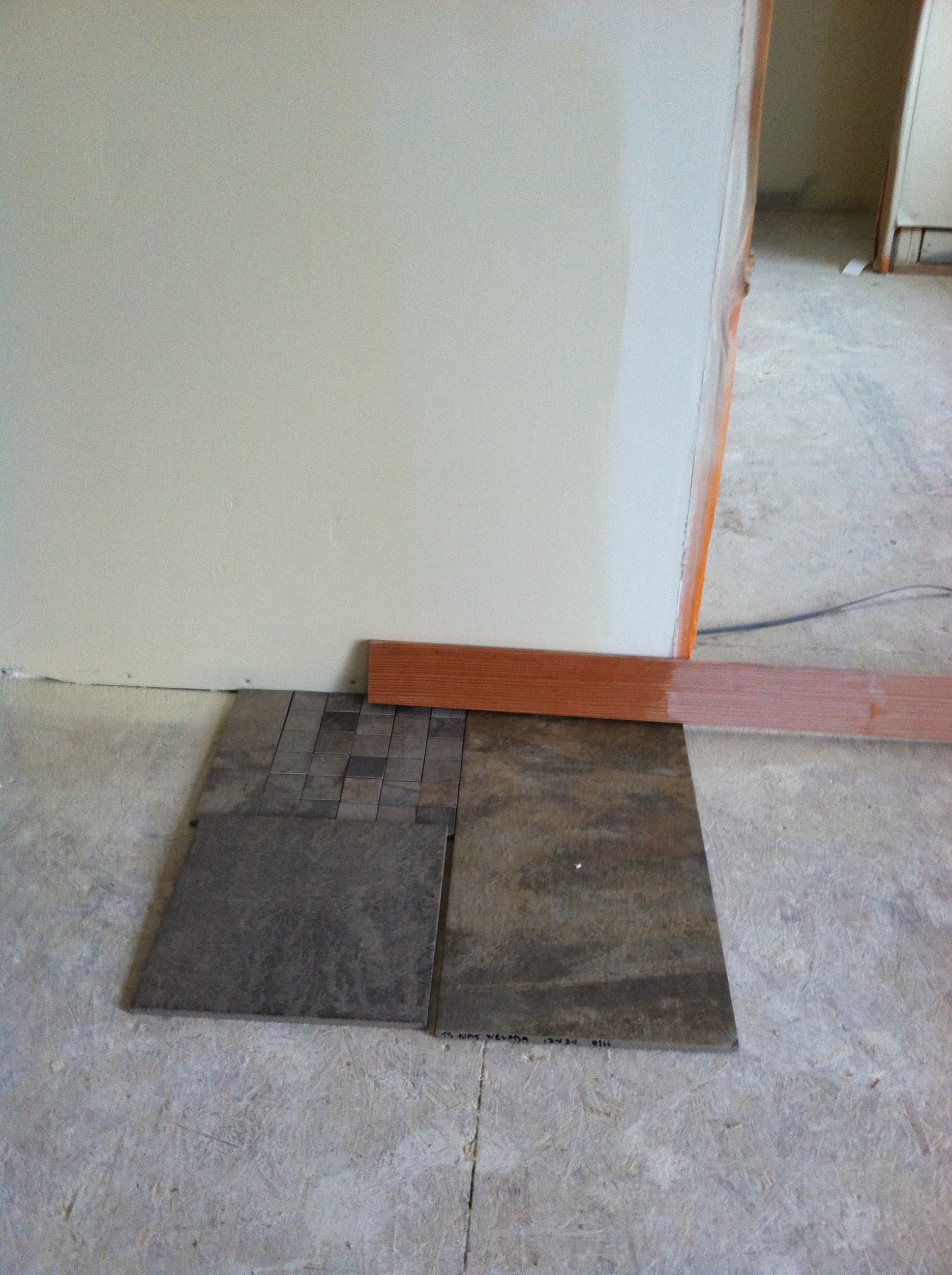
with the bathroom tile and fir (and yes, both tiles are the “Ayers Rock – Gold”)

and finally with the bamboo floor and kitchen counter, plus a tile board that was going to be the kitchen back-splash (but is no longer).
For house color, I picked the second wall-smear from the right, that teensy semi-border of white-gold barely visible between the really light swathe and the much darker, almondy patch. Not too white, not too yellow. Just right.
So the paint starts going on, yippee-yay. In the blink of an eye, the whole place has a first coat. I stop by to bask in the glory –
– and I freak. The house is totally yellow!
Yes, I knew the paint would change color en masse. I knew it would morph in different weathers, at different times of day, under various artificial lights. Also, what I was looking at when I was at the peak of my freak was the master bath. I didn’t realize at the time that the skylight had been covered with a protective plastic film, that the plastic had been thoroughly coated in paint, and that the paint-stained plastic was acting like a pane of stained glass and drenching the room in an extra coat of yellow.
I called Jere, distraught. “I don’t want a yellow house!” I wailed. “Oh,” he said. “We thought you did. You gave us yellow paint chips.”
He reassured me they could fix it; I wouldn’t have to live in a yellow house. Sweet to hear, but we all knew that repainting the entire interior was a lousy idea. He suggested I give the paint a day to fully dry.
I gave it a day. I made my sister make an extra stop on her way to work next morning, so I could get her honest opinion. I gave it another day, and finally, I realized that the variations of light and angle that cause most colors to change a bit were altering this color dramatically.
I took the following pics the last day of the year, 31 December 2013. The day I fell in love with the color on the walls.
This is upstairs in the master bedroom, where I’d chosen the color in the first place. Lovely, eh? This is the color I thought I’d picked.
I went downstairs, stood with my back to the west-facing living room doors and snapped the view straight ahead, looking east. (Hi, Table!)

Hard to tell just what color the walls are… gray? orange? I turned to my right, snapped a pic,

then to my left and snapped another.

Same day, same time, same weather, same light, same paint. Different angles. Four entirely different colors.
Which was the real color – the easy-on-the-eye cream bedroom, the dark yellow den, the pristine white dining room, the dingy peach kitchen? Which shade was most likely to appear most often? How was I supposed to come to terms with this weathercock hue?
It was too much for me, the contrasts too disparate to comprehend. Desperately afraid I’d totally blown it on the interior paint, I escaped to my beloved back yard to take a final 2013 pic of the exterior –
– and saw our home-to-be shining from the inside out, glowing in the late afternoon sun like a Chinese lantern.
That’s when I knew I’d got the color exactly right. A color that can conjure a vision so elegant, so magical… how could my heart resist? Chameleon-Cream, I call it. The color of a Happy New Year.

So Happy for you. The house does glow and will be perfect for you!!!